


Unlike last month, it’s been a relatively quiet and ‘normal’ month. No jet setting off anywhere, though I have been thinking about where we can go towards the end of the summer. In fact the closest we’ve got to exploring anywhere was the ‘Pour Le France’ wine tasting at our local Majestic store, and that was only very loosely themed. I actually thought their marketing people could have made more of this, and had some fun but that’s by the by, the wine was still good. And we had to go back the next day to collect what we’d bought, always the sign of a successful evening!
We’re wine tasting again tonight at our local independent wine shop and will no doubt be heading back in the next few days to collect our South African purchases.
That seems a great way to celebrate two years since we moved here. It’s the same old adage though - it seems like we’ve been here forever, but also for no time at all at the same time. We don’t regret moving out of London one single bit, which is good news, hey?!
A new sofa and two holes
We went shopping in Nottingham for a new sofa, this time actually making it to the shop we intended. The last time we tried we were distracted and bought some rather large artwork for our stairwell, this time was much more successful and not only did we agree on a sofa style and colour and not flinch too much at the price. After checking the colour and measurements at home, we even ordered it. But would you believe, this is the only photo I took during the whole sofa shopping trip!
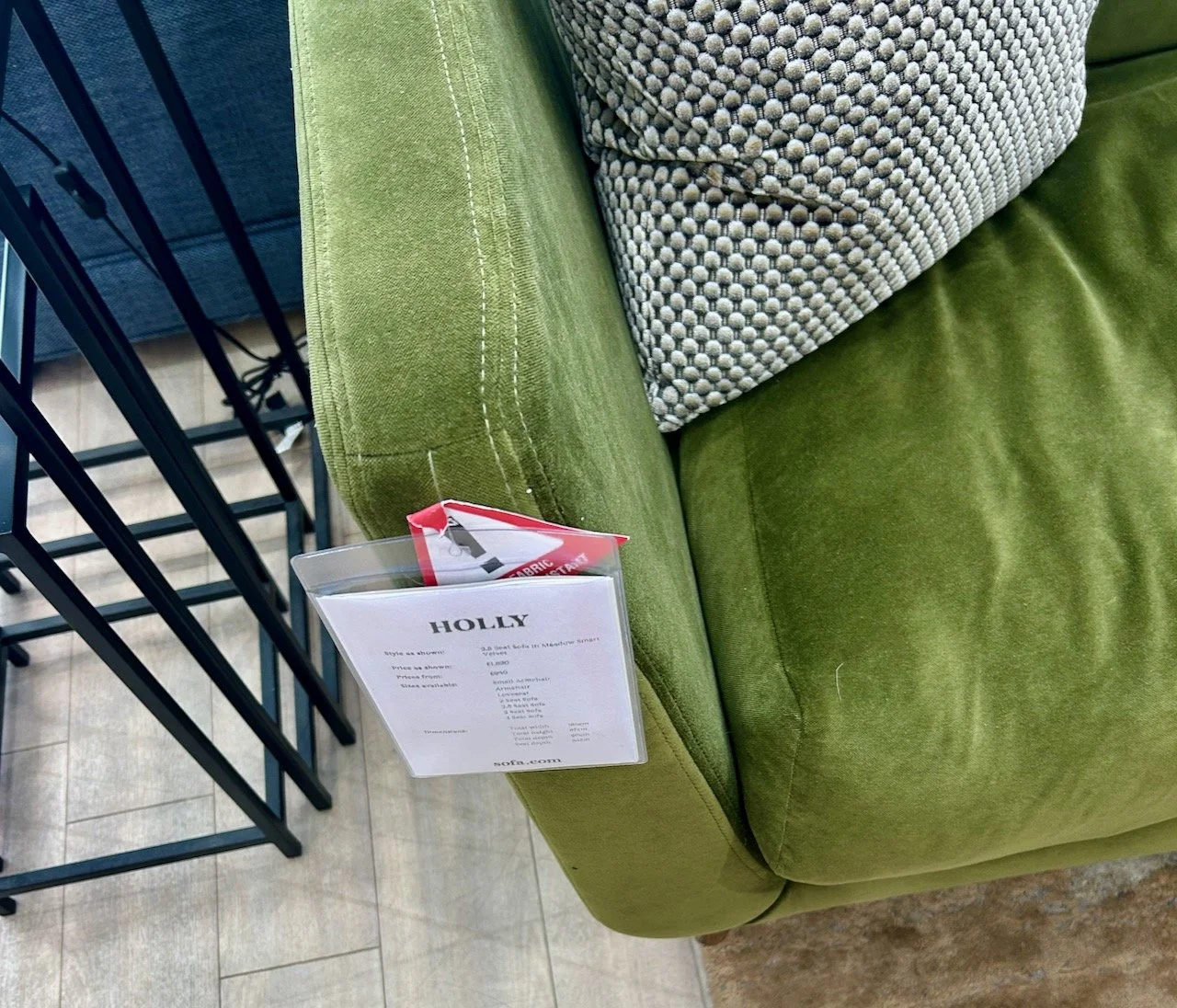
WE’RE NOT HAVING GREEN THOUGH!
It’s booked to arrive in the middle of next month, and it’ll be good to replace the garden sofa we’re currently using in the kitchen. That garden sofa, will for the first time in its history finally move into the garden - we’ve had it since 2016, so it’s lived a pretty sheltered life so far.
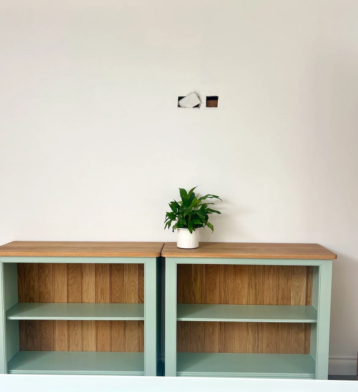
We’ve ended the month with a hole in the wall too, well two holes in the wall. We had the electrician in to move some high level sockets (intended for a wall mounted TV) down to counter level. We don’t intend having a TV in the kitchen, so it makes sense to stop looking at the sockets. Now we just have to do the final repairs.
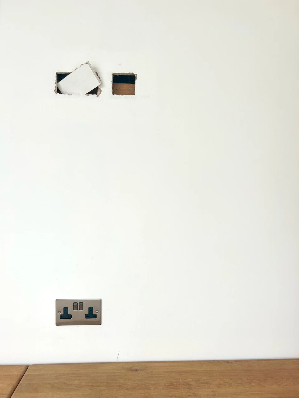
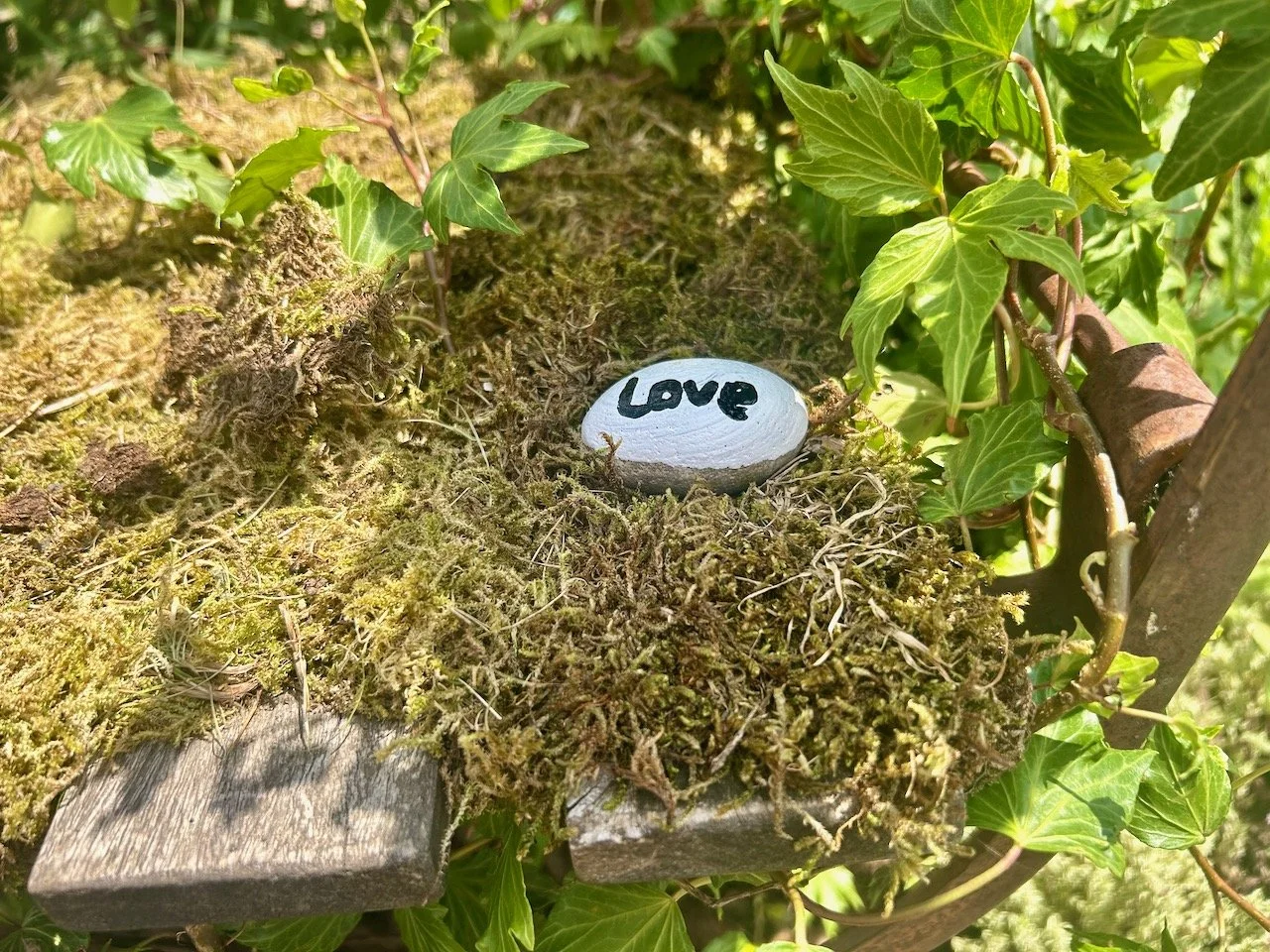
I’ll be covering the two holes temporarily with a high tech solution - a folded sheet of A4 paper. But even so it’s already looking better already, and the plant has lived there since our ‘get to know the neighbours’ party coming up for two years ago now.
I’d emptied the bookcases in case they needed to be moved, as it turned out they didn’t but it was no bad thing really as I managed to evict plenty of spider webs and random insects at the same time. And let’s face it, it’ll be a while before they get pulled out again.
While the electrician was here he added some more power sockets for our garage gym and an additional light switch so that we can have lights whichever way we go into the garage - all the mod cons us! It’s taken us a while, but we are finally making headway in sorting out the garage. We’re having a bit of a moving box amnesty with various batches heading off to people living locally who need boxes, as well as some put aside for the youngest niece. So much so that we can almost see the floor in the garage now - and yes, it’s dusty!
I’ve worked out the optimum racking solution for the garage and while sorting it out may still be a bit like one of those puzzles where you move things around for a while before they find their proper home, it is starting to come together.
Mostly sunny BBQs and rainy Saturdays
We’ve celebrated birthdays this month with barbecues starting with MOH’s at the start of the month, closely followed by a trip to Sunny Hunny (which wasn’t so sunny) to celebrate my dad’s 91st birthday, albeit a bit earlier than usual. Last year for dad’s 90th birthday I made him some bunting, this year it got an upgrade so look out for the post on that.
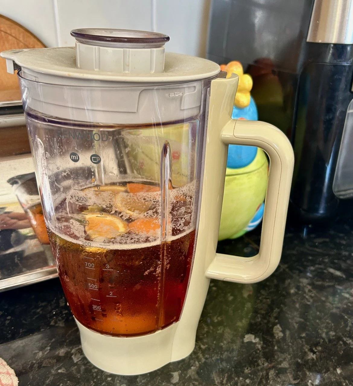
We arrived with everything needed for an impromptu family get together. That is apart from the jug for the Pimms, but we improvised, and improvised well…
It even had a lid!
There’s been a rainy Saturday or two as well this month, but that’s not been so bad as there’s been plenty of sport to keep us entertained; the British & Irish Lions, the Tour de France, the darts and so much more, that we haven’t really minded the wet -but still humid - weekends. And it won’t be long before the football season starts again though we’re currently unsure where, or if, we’ll be able to watch the Community Shield between each of our teams as that’s another fixture that’s fallen to TNT Sports.
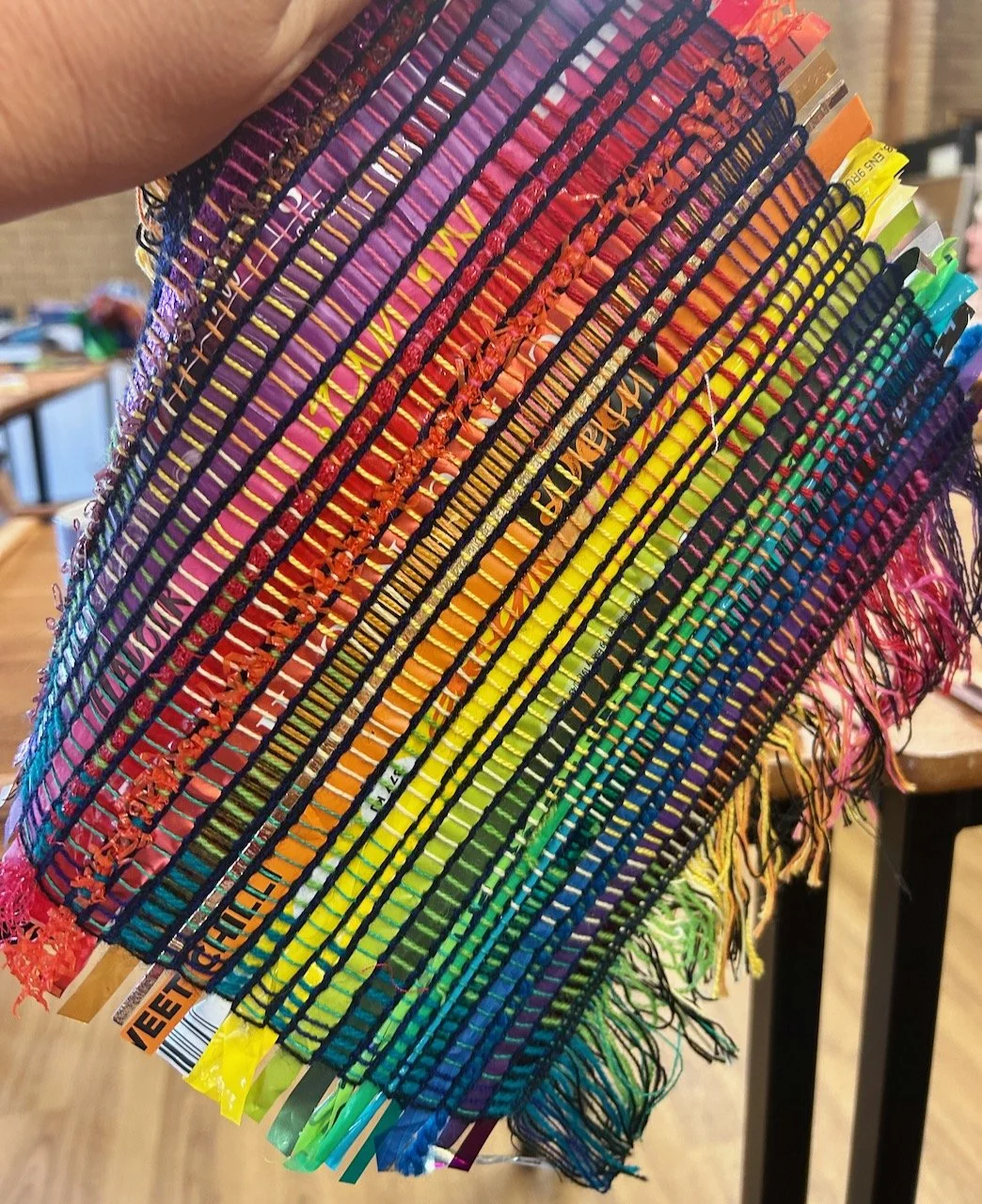
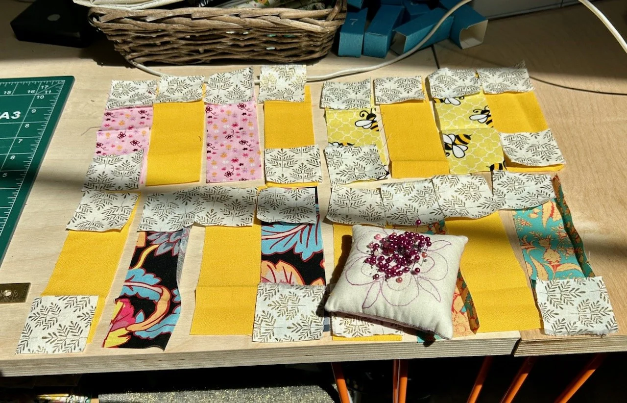
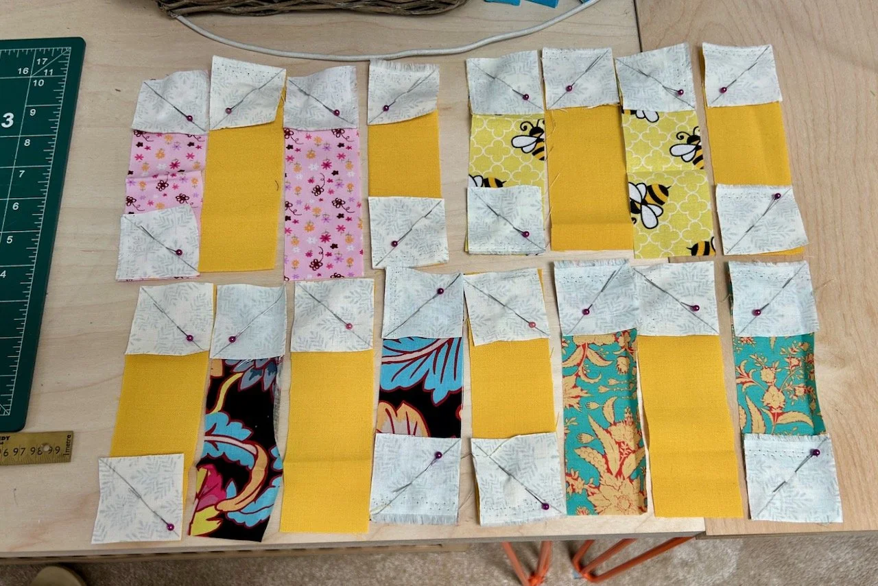
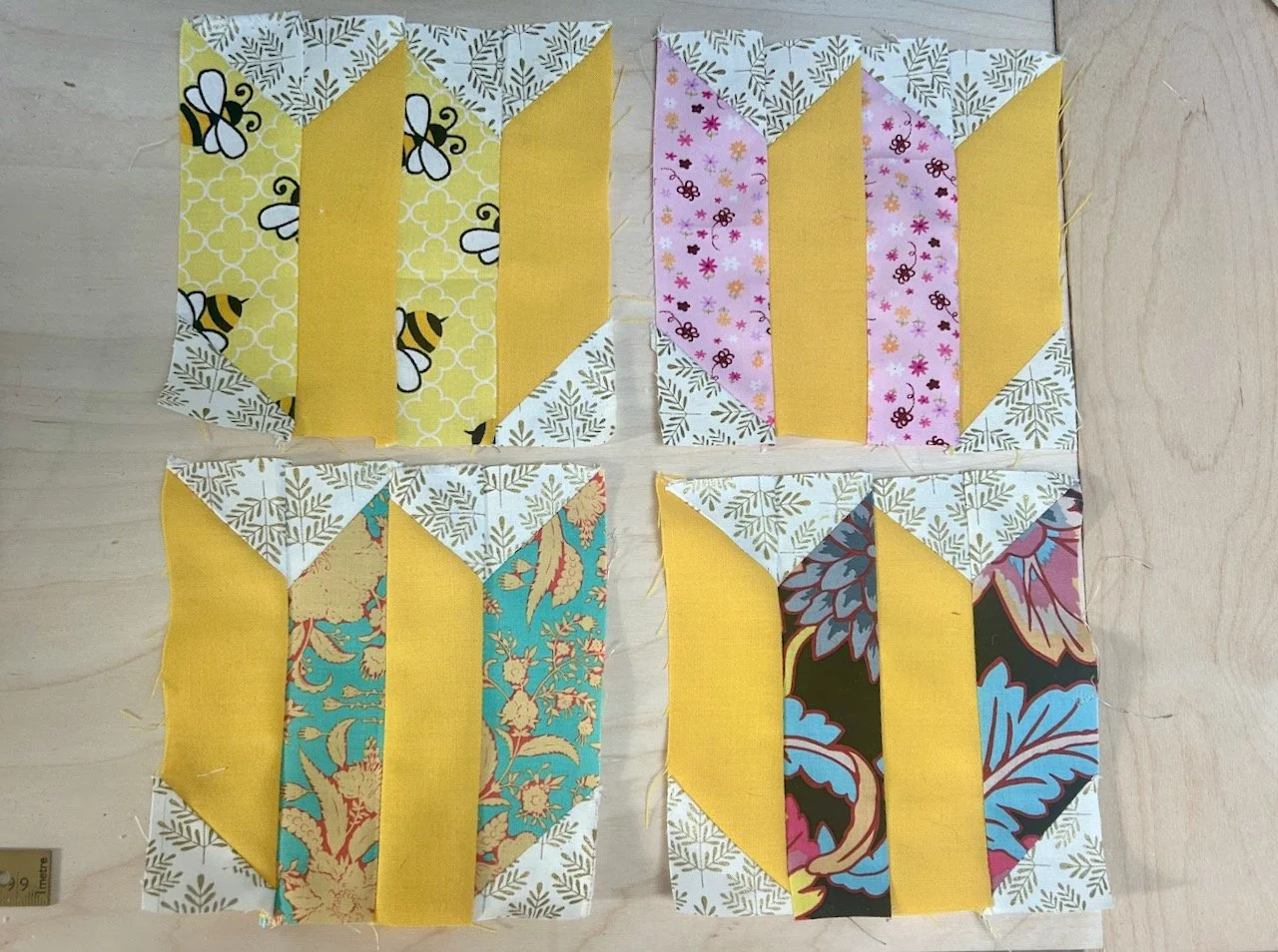
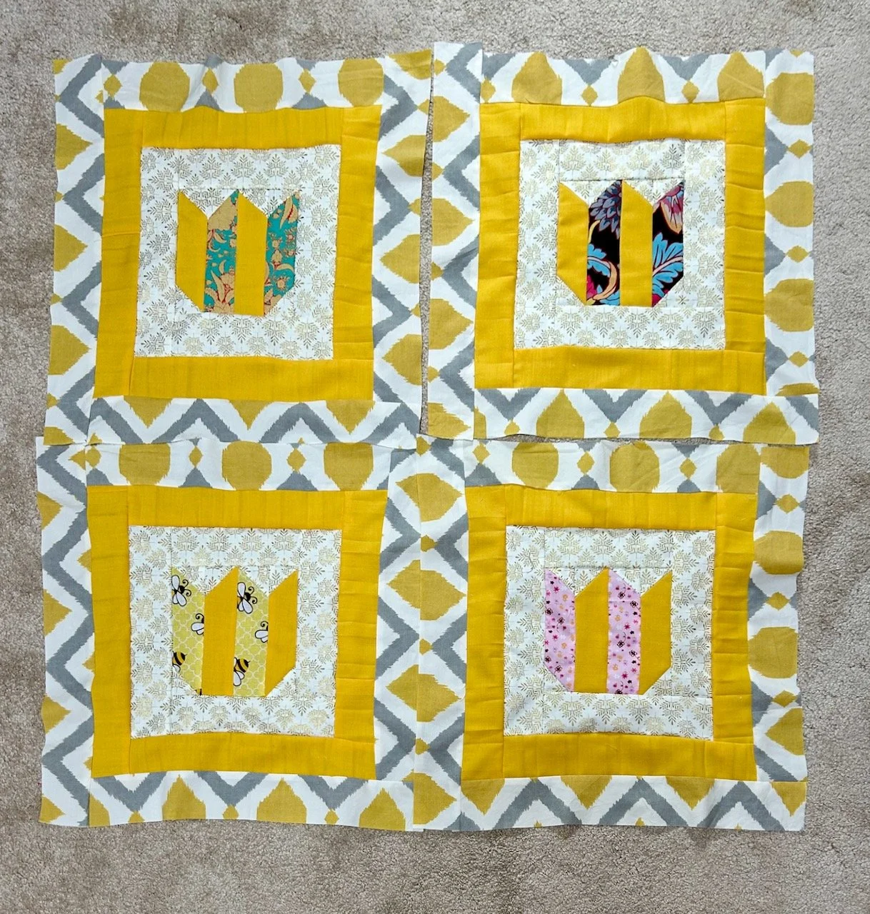
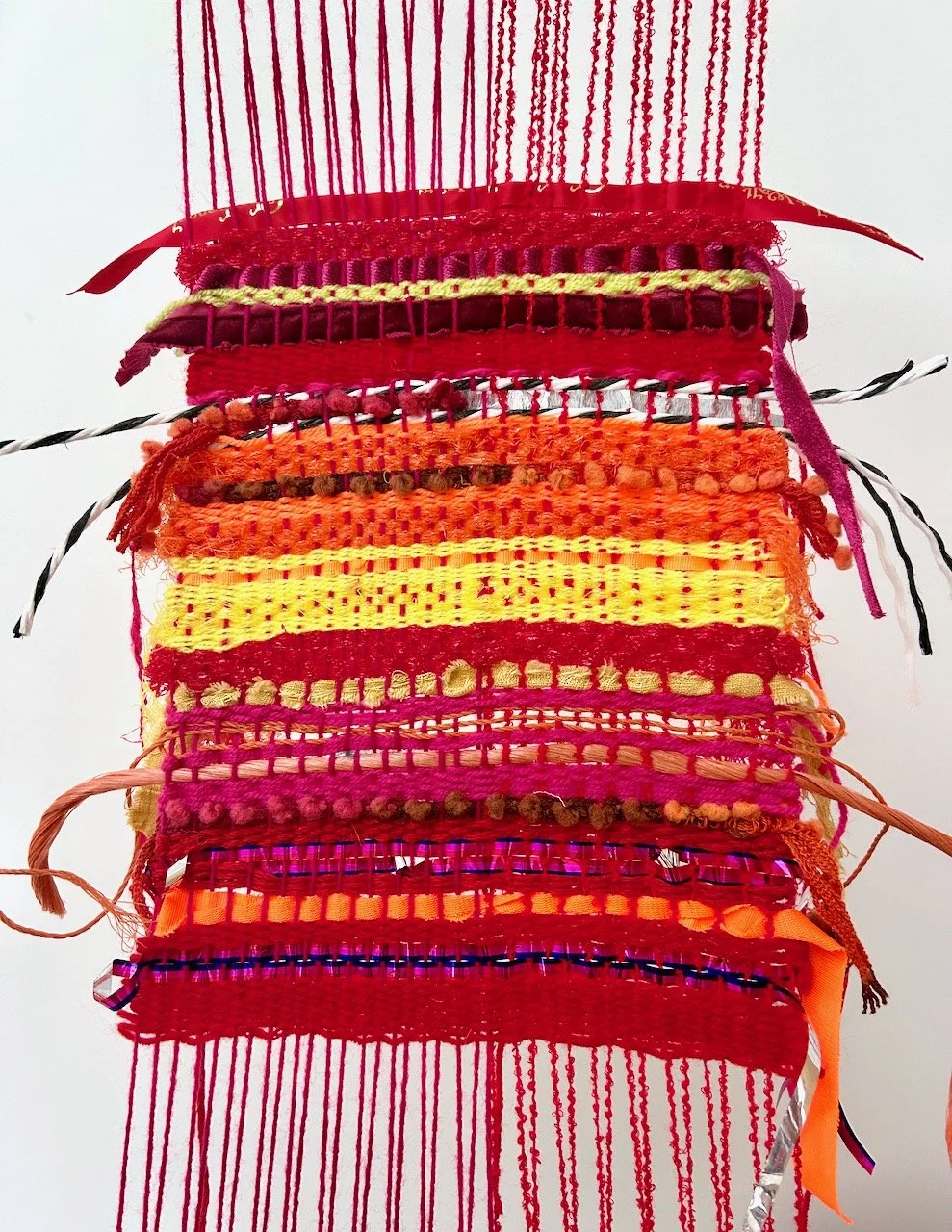
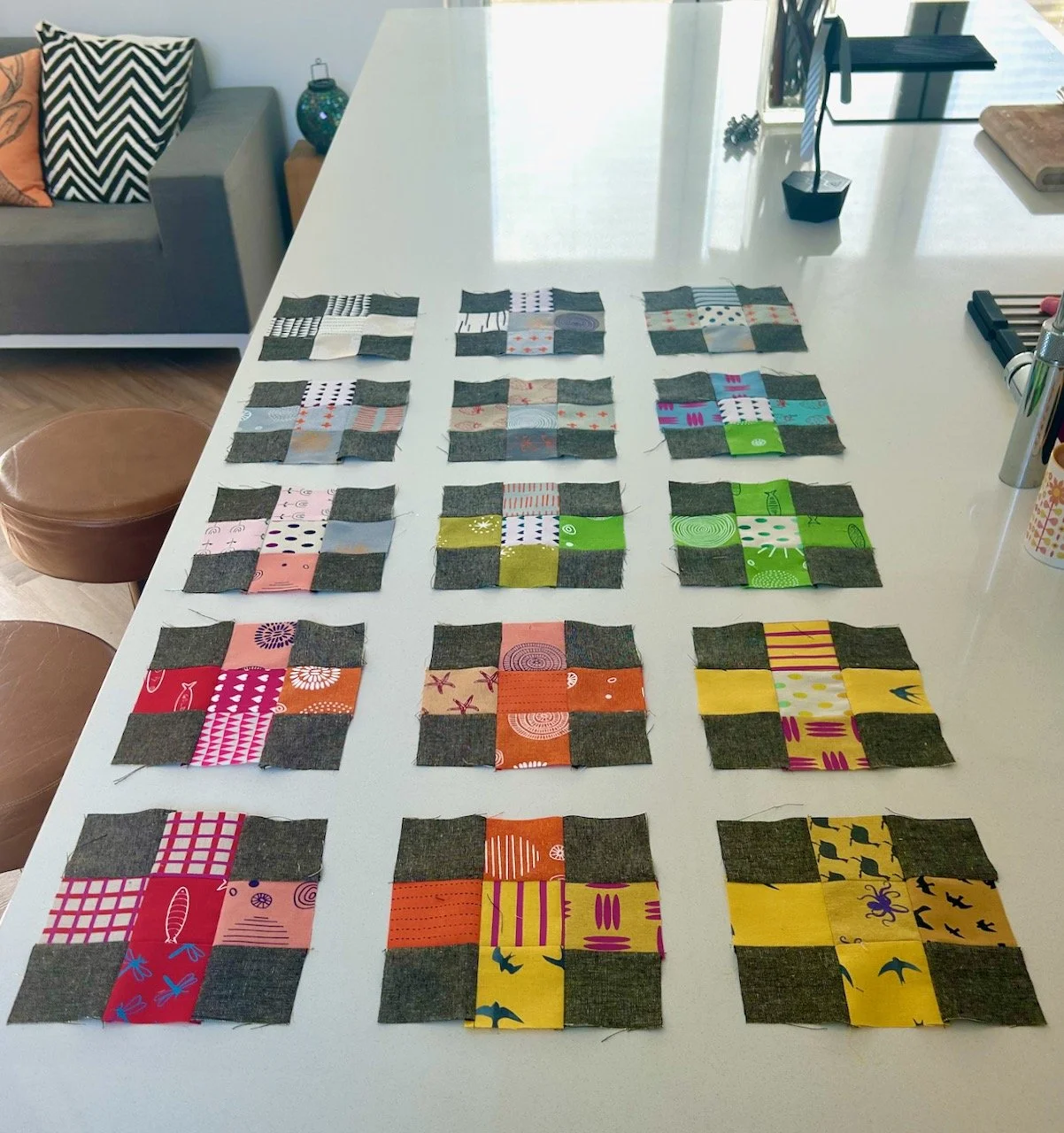
A new craft
You’ll have seen that I’ve picked up a new hobby this month, and one that I think may actually lead MOH to despair. I already had a fair bit of what I’ll call ‘a waste stash’ by which I mean those bits you keep because they could be handy one day, and now I’m looking at everything with fresh eyes. As the days go by I’m finding more and more things in my craft room that could come in useful for this new ‘need’ - I just need to work out how to fit it in alongside everything else, and how not to make over-extensive plans. The usual really!
I’ve also been getting to know my new ‘take to’ sewing machine, which was a purchase at the start of the month. I’d planned to take my old Toyota sewing machine to my sewing group, instead of the hand sewing that I usually take, and thankfully had the idea to try it before I went. Sadly that didn’t go so well as the machine goes up and down, but not forward. It also sounds like a train - and not one of those quiet ones, so I took myself off to the sewing machine shop for a new one. Look out for a post in the coming weeks about my ‘take to’ workshops and sewing group machine, and my first makes using it.
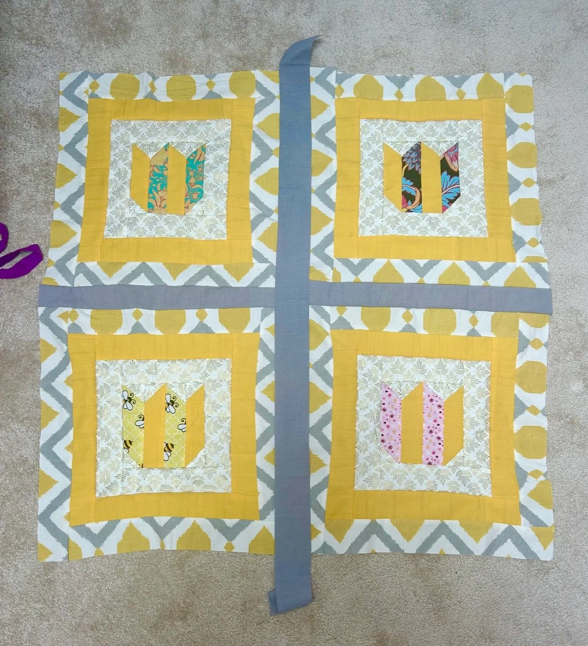
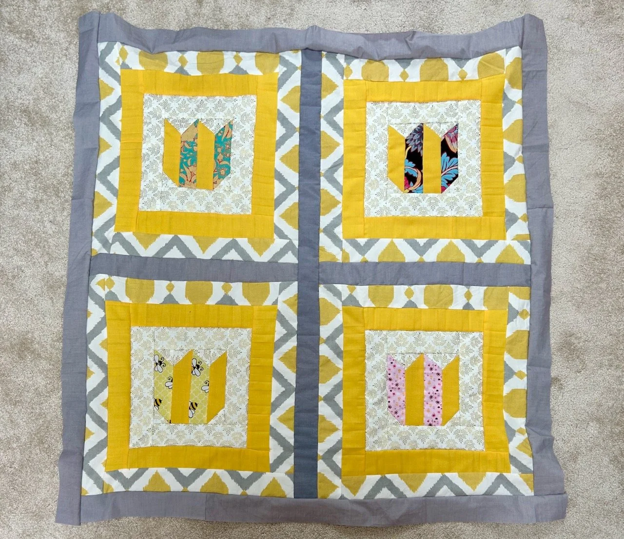
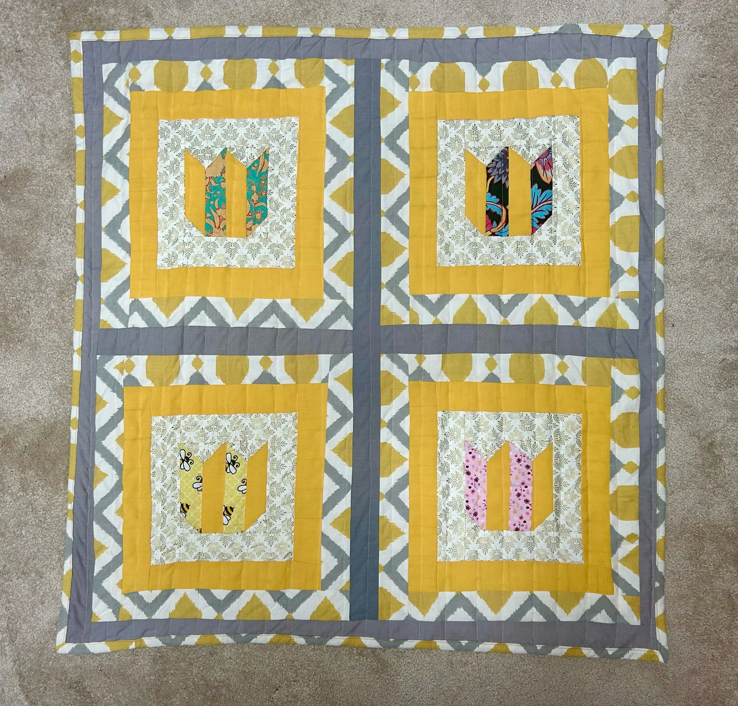
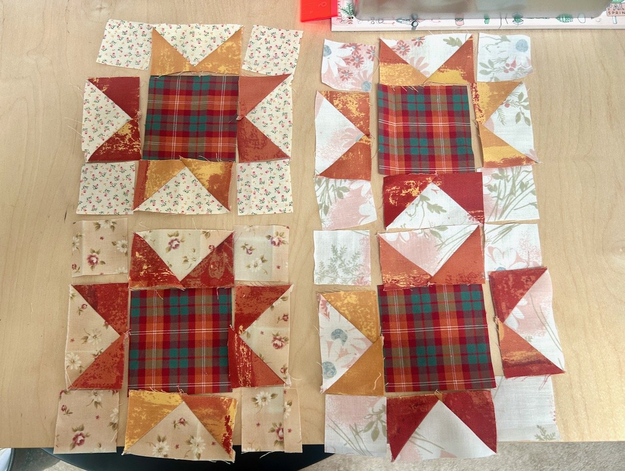
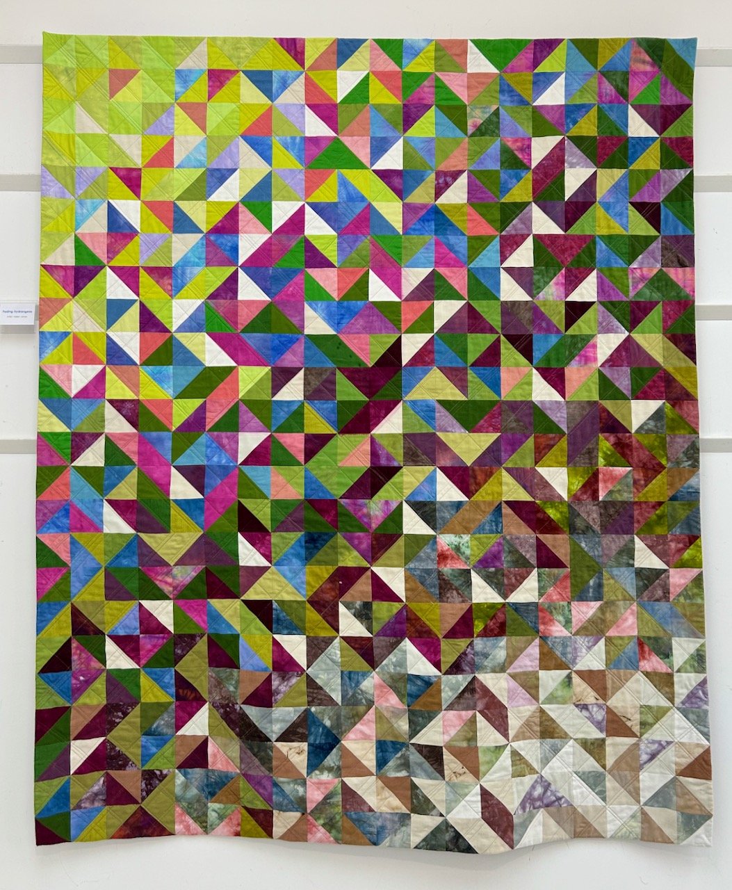
And I’ll leave you with the current state of my ‘Essex Kisses’ quilt which featured in my June quilty update.
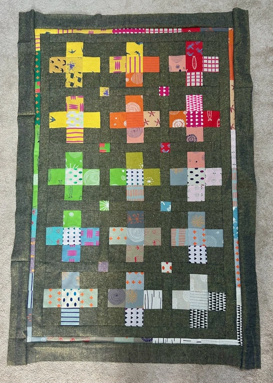
It’s so close to being almost there, that I’m hoping that once I’ve got my June charity quilt and Block of the month finished, I’ll be able to crack on with this. I’ve now got the perfect backing fabric for this, and have ideas about how I want to quilt it - but I’ll save that for the update when it’s done.
All I need is not to get too distracted by my visit to the Festival of Quilts this weekend - wish me luck!
If you want to read my previous monthly updates in my ‘This is’ series you’re very welcome.