

Much earlier in the year I set out my quilt plans for 2025 with number 6 on the list being:
6. My English Paper Piecing (EPP) blue diamonds
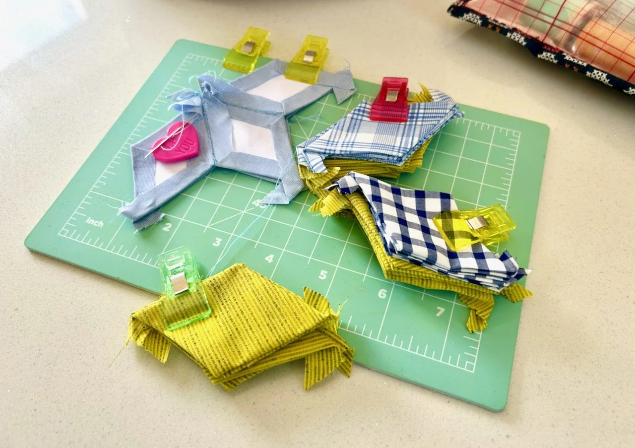
This is my hand sewing project which I’ll take to my monthly sewing group evening meetings, and no doubt will pick up in between those too, as it’s a good project for keeping my hands busy. The diamonds are small - I like a challenge, clearly! - and I’m using pre-loved fabric for this. The central diamonds will be various blues from MOH’s old shirts - some patterned, some plain and each of these will be outlined with bright lime diamonds, which is material left over from another project long ago.
As the diamonds are small, my updated plan is to place much larger diamonds between the hand sewn blocks, which will help with progress! I’ve got an old embroidered tablecloth which I bought on eBay for this - which may be a bit controversial for some cutting this up, but I’m ok with it. Whether or not I’d cut up a family heirloom is another matter, but that’s not something I need to consider for this project.
Introducing my EPP project
As I said it’s a hand sewing project, but one which needs to be pretty portable so for this I’m using my Yarnivore project bag from Vicki Brown Designs a while back - and while it’s not descriptive of the contents, it’s a great size for this project. I’m able to include a mini cutting board, a pouch full of threads and a glue stick, plus the material covered diamonds which are ready to sew and quite a few which have already been sewn.
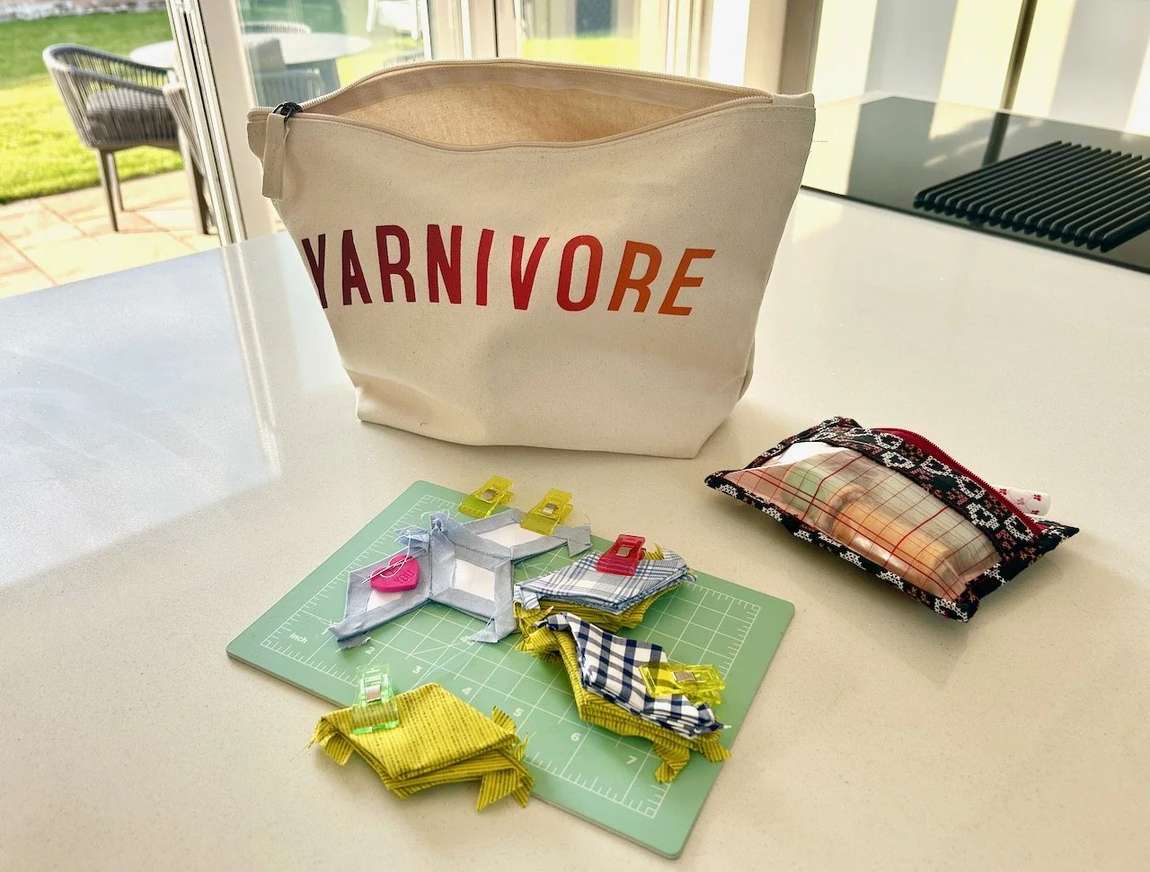
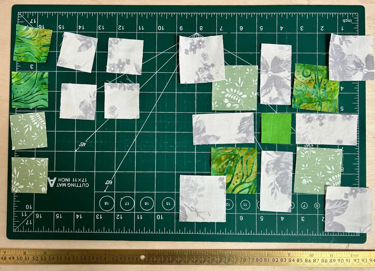
And yes, the diamonds are pretty small - they’re about two inches in length. I bought the white templates from eBay as my patience doesn’t extend to cutting those too!
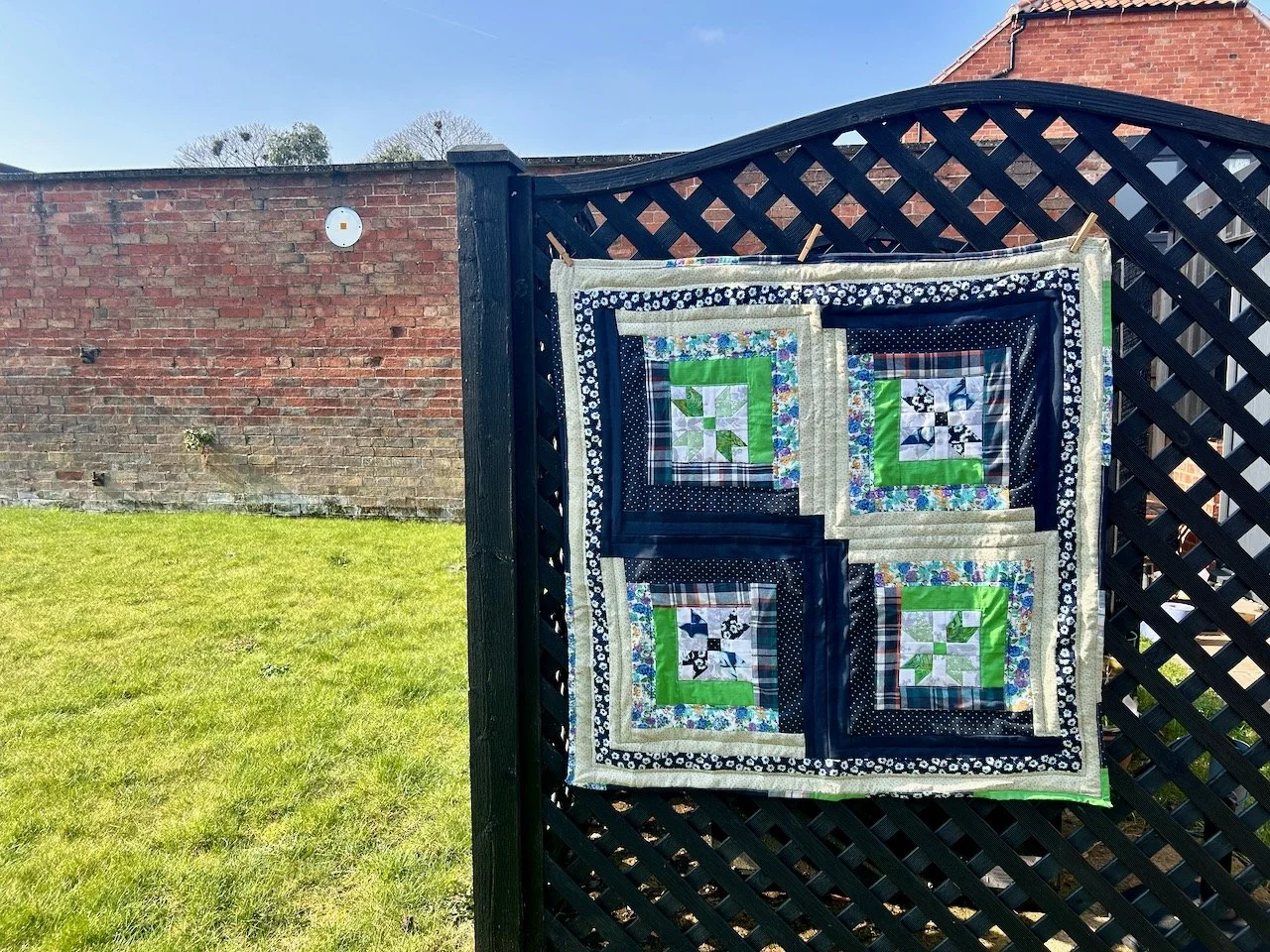
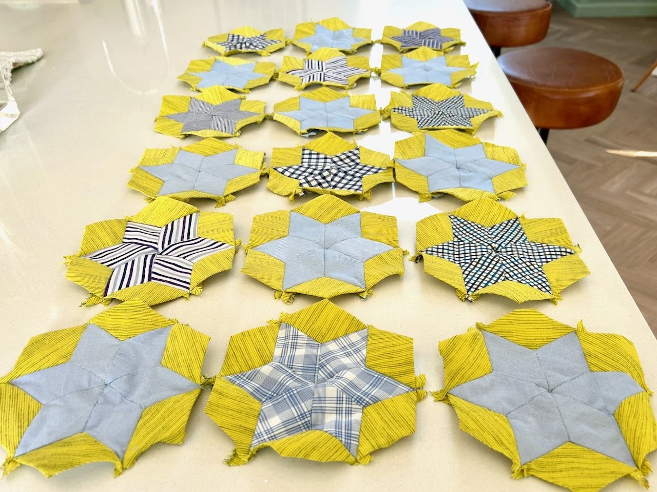
The blues I’m using are all from MOH’s old shirts and the lime green is from my stash. I like the colours together and have been playing with layouts, even though it’s early days - I’ve only eighteen completed, and I’m going to need quite a few more.
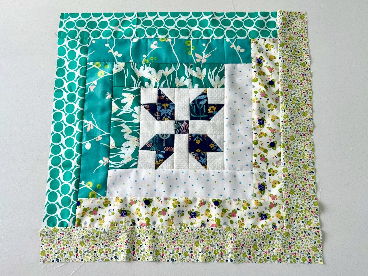
Through testing the layouts I realised i liked it when there’s a plain blue ‘star’ interspersed with the patterned ‘stars’ like in the image below.
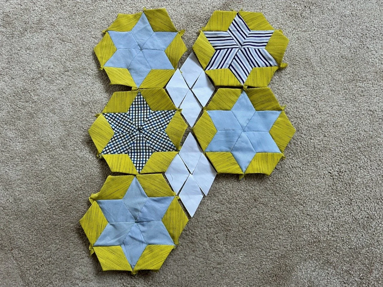
And to mock up how the gaps could be filled I’ve used the white diamond templates. These will be a large diamond, not four as shown in this image, and that’s where the new-to-me vintage table cloth will come it, not that I’ve been brave enough to cut it yet. I’m biding my time and will switch to that when I’m fed up of the lime blue diamonds.
Clearly lime blue isn’t a colour, but it’s the working name for my quilt as that’s what I see - and it’s stuck. Once it’s all together, and I’m not sure how big I’m aiming for, then we’ll see if the name still works. I’m also thinking that I might add further adornments, perhaps buttons, perhaps beads but that’s a decision for another day.
I’ll update you again when there’s more than just my lime blue diamonds, which may not be for a while!