Hidden Depths by AitchBee at the Newark Quilt Show

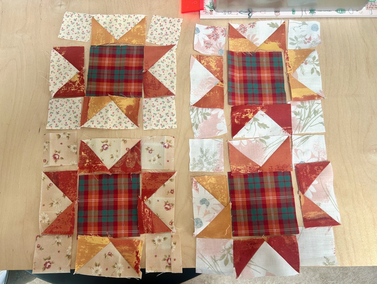
The quilts I’m sharing today from this year’s Newark Quilt Show include the maker’s love of typefaces and letter forms, as well of their fondness for 3D imagery. It won’t be a surprise that AitchBee trained as a graphic designer, but now thinks of themselves as one who works in cloth, enjoying the precise imagery that comes with foundation paper piecing (FPP), which is something I’ve not tried myself yet.

All of the quilts are amazing, and one is my all time favourite from this year’s show. I like its cleverness and spent a fair while looking at it, before I really saw it - and then looking at it through my phone’s camera lens made it so much easier to see, and then you wonder why you never saw it before.

The quilt is called Negative Space, which again is clever and did more than raise a smile.
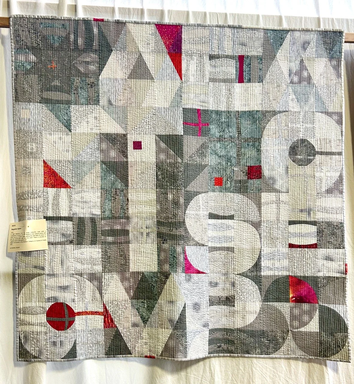
NEGATIVE SPACE

I’m not sure how well it translates on a screen, so read down each column of letters and hopefully you’ll get it - if not, think of the quilt’s name, and then it should materialise. And of course, then you’ll realise that there isn’t any negative space at all!

It’s subtle, beautiful and yes, I’d happily have this one anywhere in my house.

But there were more quilts too, the one below at first you see the cubes, then you look more deeply - and the more you look, the more you see.
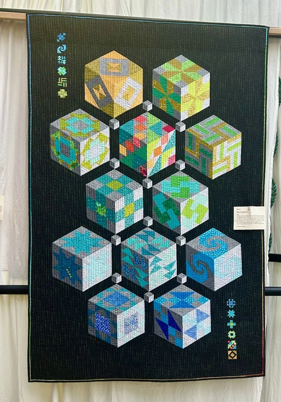
NEW PERSPECTIVES

Those small blocks are 1 1/2 versions - now that’s small, and no doubt fiddly.

I’m also a fan of how these are quilted, with multiple vertical lines and it’s something that I hope to replicate on my Essex Linen kisses quilt, but there’s a way to go on that yet though!
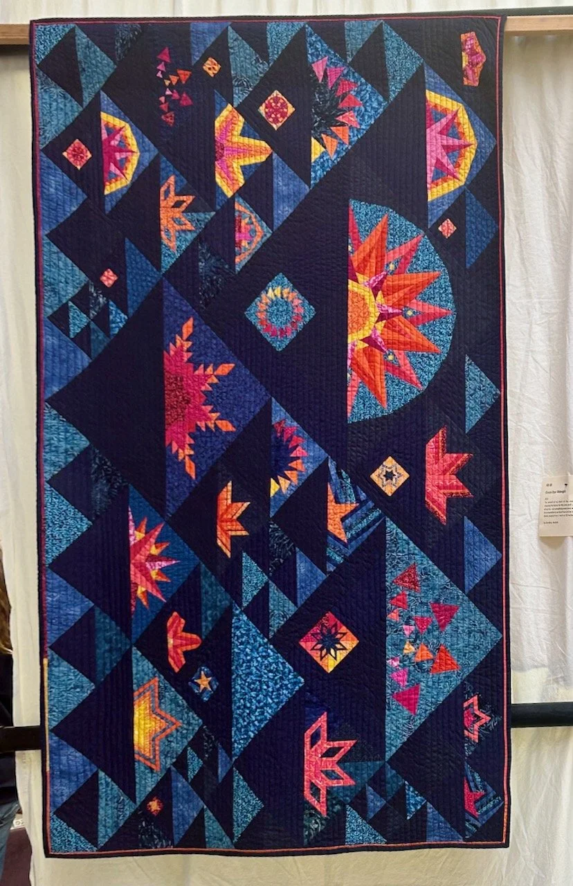
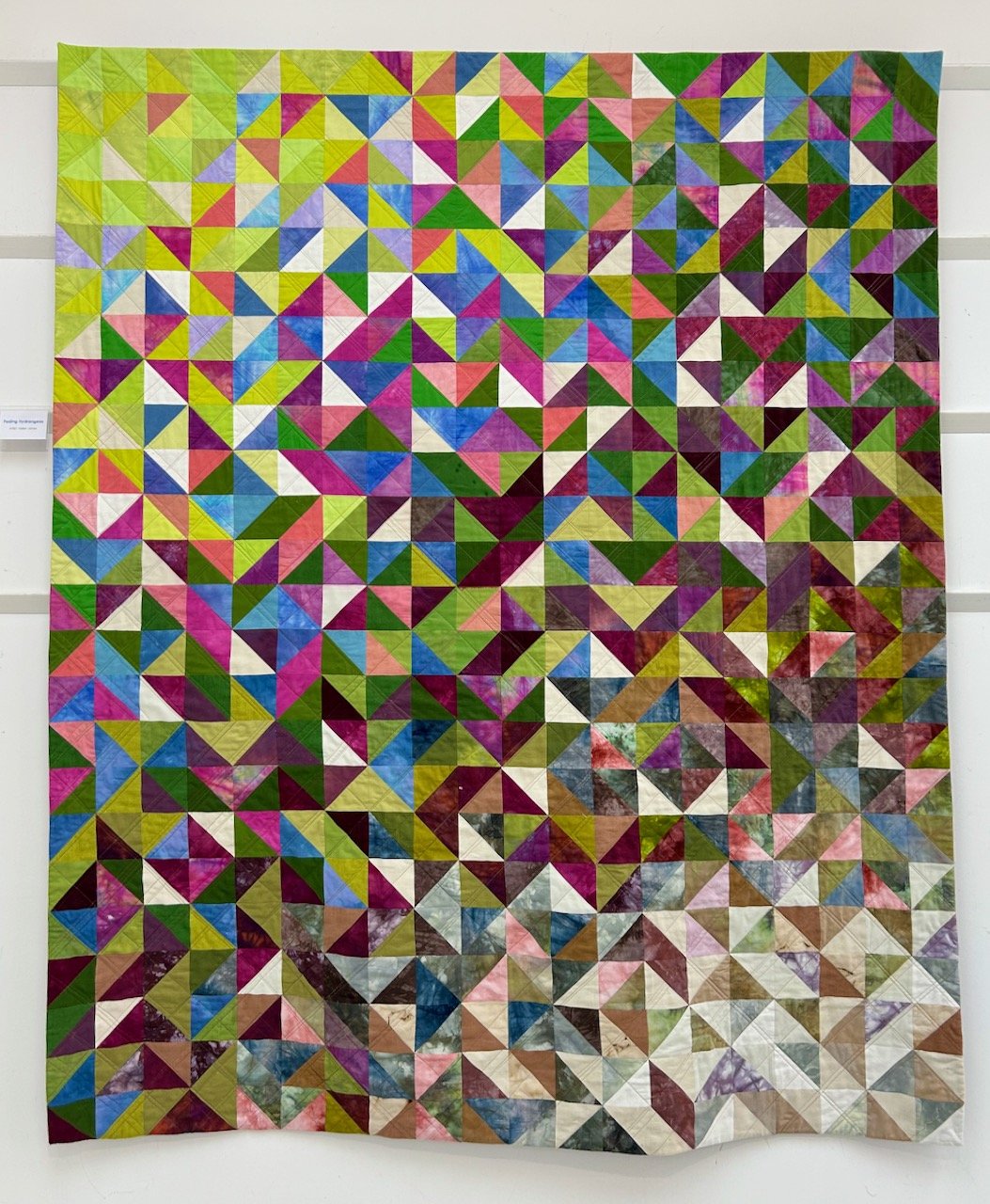
OCEAN STAR MIDNIGHT

I love the colours on this one, and it includes FPP blocks ranging from 1 inch to 16 inches across so that’s a good reminder that not all blocks need to be the same size, though of course that makes it a lot easier.

The final quilt I’m sharing from AitchBee is full of colour, and couldn’t be further from the first one in this post colour-wise, but it’s an expansion on that, and includes the whole alphabet.
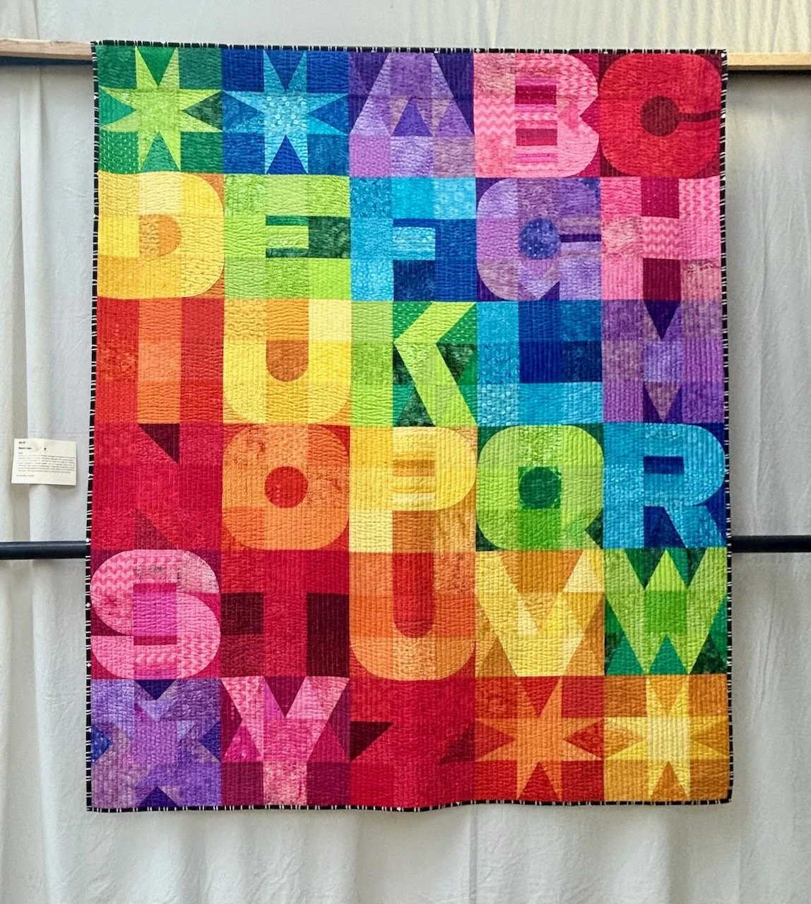
BLOCK CAPS

This one is an expansion on the Negative Space quilt, and includes the whole alphabet. It was interesting to read that they got stuck on the letter ‘B’ needing to enlist help with it, and a lot of coffee and cake before it looked right. Reassuring too, as it’s good to hear that even quilts which end up looking up as good as this aren’t always plain sailing.

So much inspiration here, and in a completely different way to the other quilts I’ve shared from the show. It almost makes me want to try Foundation Paper Piecing, but I know I really shouldn’t add more to my list, well just yet anyway!

Traditional Quilts by Hopkin Rees at the Newark Quilt Show

I’m sharing some more quilts from this year’s Newark Quilt Show and the first few really did make me go wow - and it’s unusual for me to be so taken by the quilting alone, but it really is a work of art.

These whole cloth quilts really are beautiful, and the skill level really is in the quilting rather than the piecing, and then the quilting as the other quilts I’ve shared have been. What I also noticed is that the colour really does make a difference to its impact. By far my favourite was this mustard version, but I’ve also included a green quilt and a grey one - which are equally as detailed, and taking nothing away from them, but for me the impact is less. Take a look and let me know what you think.

But first let me share a little more about the maker, Hopkin Rees who says that craftmanship has been central to their upbringing, and that in their eighty-four years they have had several incarnations of which quilting is the latest.

They’ve been an English teacher specialising in children’s literature, a night school instructor in cabinet-making, a librarian, a marquetarian and a dressmaker. Which is quite a mix!

A 'one piece' quilt in mustard with ornate detailing in the quilting

MUSTARD SCALLOPED NORTHUMBRIAN, HOPKIN REES

They had been expected to go to art college whilst at school, but their father was not in favour, instead preferring going to university with their art being something they could do ‘on the side’, so that’s what happened.

It wasn’t until they married, when they were encouraged by their seamstress mother-in-law who taught them sewing when they expressed an interest, and the happy couple received a sewing machine as a wedding present with ‘which I made clothes for my wife and the children’.

MID-GREEN WELSH WHOLECLOTH, HOPKIN REES

In the show notes they said they couldn’t explain where their urge for quilting came from, but once it started they became addicted and learnt from YouTube and books. In the last ten years they have produced over two hundred quilt items, and latterly have ‘finally been able to express [their] early interest in art and design’ producing amongst other items these traditional wholecloth Welsh and Durham quilts.

A whole piece quilt by Hopkin Rees at the 2025 Newark Quilt Show

GREY SCALLOPED DURHAM, HOPKIN REES

The whole cloth colour totally changes the feel (or vibe if you will) of the quilt - you may not be able to tell from the photo above, but it’s not a plain grey cloth, it’s covered with small white polka dots.

And if you pick up on the fact that the green quilt above has feathers and is also Welsh then the maker says that they’ve included feathers because they love them, even though traditional Welsh quilts rare feature them, if at all. And I think that’s fair enough, your quilt - your rules!

I’ve also included two colourways of the Dahlia quilt, which I think are more my normal go to quilt designs, but even these aren’t straight forward as they had to work out how to extend the Dahlia design to make this into a rectangular quilt by enlarging and echoing the out petals of the template, taking the well known method of ‘hit and miss’ until they got it right - and isn’t it wonderful that they did?

RED DAHLIA, HOPKIN REES

BLUE DAHLIA, HOPKIN REES

The blue dahlia was made first, and blue was chosen as blue dahlias do not exist in nature - I’m sure that if they did, they’d look just as good as this one, and it was great to get the opportunity to view these quilts from a very talented, and versatile maker.

The Improv Quilting Journal Quilt Challenge at the Newark Quilt Show

Another of the exhibitions at this year’s Newark Quilt Show was the Journal Quilt Challenge, where quilters make two A4 size quilts based on the theme for the year, which for 2025 was Improv Quilting.

And for small quilts, there’s a lot of work in these - and there were plenty of entries, way more than I can show in a single post, so I’ve chosen my favourites to include here.

The show notes advise that ‘Improv patchwork & quilting is very ‘on trend’ at the moment but some quilters may be hesitant to try something new without the safety net of rules’ - but then again, that goes for a lot of things in life doesn’t it?

For me the standout entry was the two collages by Joan Weston - not only the subject matter, but also the materials used - fabrics, papers, newspaper extracts as well as stitching and the final products.

WE WILL FIGHT, JOAN WESTON

WE WILL NOT LOSE, JOAN WESTON

The top quilt, which remember is just A4 sized, is a collage of fabrics, papers, newspaper extract and stitching representing the invasion of Ukraine and Zelensky’s moving response channelling Churchill’s speech decades earlier. The second represents the destruction of the cities in Ukraine using newspaper cuttings, photographs and stitching. The stitches show the winter weather suffered by homeless people, bombs and the bloodshed.

No matter what your views on the subject matter, both pieces are incredibly detailed and the amount of work in such a small piece is mind blowing, and totally amazing - and definitely fits into the Improv Quilting category.

Other quilters took a more traditional approach playing with more recognisable quilting shapes and designs - you’ll no doubt recognise some of those which have been given the improv treatment.

UPS & DOWNS AND GOING IN CIRCLES, HANNAH CARLISLE

IMPROV 8-POINTED STAR AND IMPROV QUADRANGLES, RUTH CASE

MODERN LOG CABIN #1 AND #2

Other quilters took a less structured approach and used the materials, colours, shapes and stitching to represent a wide array of topics - from migraines and recovery, to cities and nature.

MIGRAINE AND RECOVERY, DEBORAH COLLINS

IMPRESSIONS OF NICE: I AND II, JULIET WEST

JUST WINGING IT I AND II, SHEENA ROBERTS

And then there was the completely wacky - and I say this full of admiration - the riot of colours, approaches and textures was equally as amazing.

WEIRD WILD WORLD AND WILD WEIRD WOLRD, MARY WATTS

STRANGE WORLDS AND LIFT OFF, HOPKIN REES

CYCLOPS AND STRING ADAGIO, HOPKIN REES

It’s also clear that these small quilts are equally as addictive as their larger versions - and I’m sure aren’t significantly less work either. The second inclusion by Hopkin Rees above was also reassuringly honest, and demonstrates that many crafters continue to be unhappy with their work. The Cyclops and String Adagio quilts were originally pieced and appliquéd but unhappy with the effect they ‘over sewed each separate fabric piece with vibrant stitch painting’ resulting in blocks of solid colour - the end result is particularly stunning I think.

QUALITY STREET, MARIA JEANNETTE

ROSES, MARIA JEANNETTE

These final two did raise a smile, which was the maker’s intention, though while I bet they were fun to make and are instantly recognisable, I think I’ll stick with the real thing!