Dark and blowsy

It’s not quite the golden loo that went missing from Blenheim Palace, and I don’t have anything comparable. But I do have plenty of loos. Or rather photos of them. This one’s one from Grand Designs last year, where of all things they had a whole section dedicated to the smallest room, and the Lavatory Project. Who’d have thought hey?

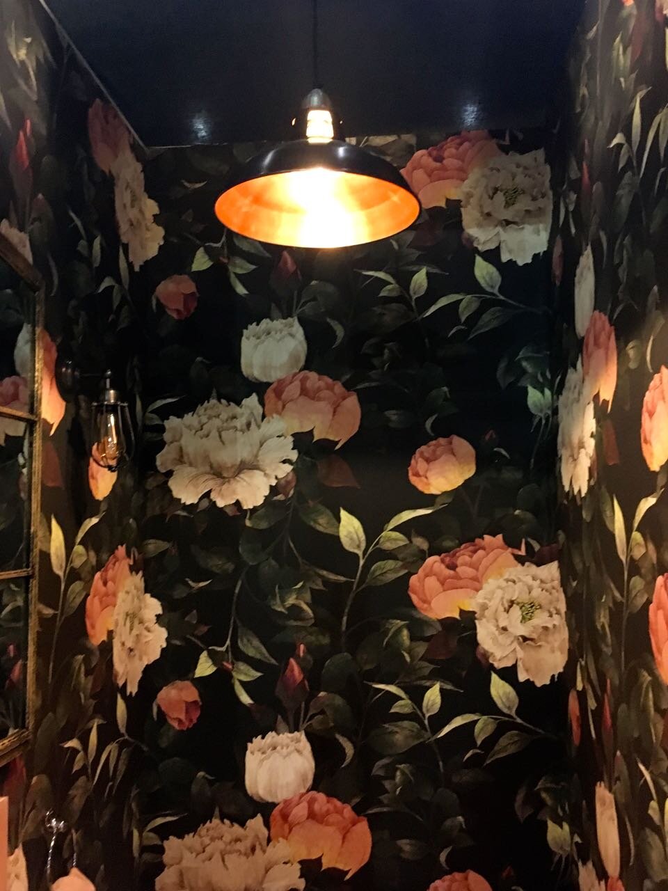
Today’s Lavatory Project is potentially a bit marmite, if you can be a bit marmite!

dark wallpaper and a dark mirror

I’m very much of the opinion that you can go bold in a small space, and especially in a downstairs loo. But then again I don’t have one, so it’s easy to say that isn’t it? I like how the frame of the mirror is also dark, and the wall lights either side of it too.

There’s hints of copper too, which works well with the pink flowers and the splashback tiles.

dark wallpaper and a white suite

I’m not sure about the potted plants in the loo, or the gardening tools, but I guess some artistic licence in this environment is allowed!

pale pink tiles behind the sink

Yes, see what I mean about the watering can. Though it’s a very nice watering can!

And with a room with dark decor, light is even more important than normal. Alongside the wall lights, there’s an overhead industrial pendant light - the sort that you regularly see on Salvage Hunters (yes, I’m still working my way through hundreds of episodes), though this one picks up on the copper theme again.

an industrial light with a copper inner

What do you think?

Lavatory Project: Spots and stripes

This one isn’t for the faint hearted. It is rather bold, and if you’re of a delicate nature then I advise sunglasses. Just like my dad when he took me to Abba: The Movie, which I’ve just had to google the year for. It was 19 cough cough 78 cough. I was very young. And he didn’t wear the sunglasses, and not just because he wasn’t allowed.

That said, I quite like this one.

Black and white striped wallpaper for the lavatory project at Grand designs live

I think it’s ok in a small space, in a larger room I think my eyes might go a bit, well a bit everything. Or maybe the extra space would make it slightly calmer, who knows. This size space is all we have though, and while we often think bold dark patterns don’t work in small spaces, we’ve been proven wrong.

IMG_6977.jpg

You’re probably wondering if those mirrors were the spots, aren’t you? Well they could be, but it’s the floor that’s really spotty, and it’s not a shrinking violet either.

IMG_6978.jpg

Actually the floor has just jogged memories of a wall in my bedroom growing up. I insisted that I wanted pink spots on the wall, and my poor long suffering parents agreed, but I had to do it myself, which must have been torture for them. I was quite pleased with the result, although looking back it shouts Mr Blobby to me. I’m sure they were relieved when the next colourway came along, I can’t remember what that was, so it was nowhere near as memorable.

I think they’d have drawn the line at such a bold colour scheme though. I think, actually I hope!

This next shot is my favourite, it’s got a bit of the whole room in it, and I wasn’t surprised to see a record on the wall - it fits well with the theme.

Spots stripes and a brilliant white washbasin

And did you notice the tap? Isn’t it stunning - and the tiles, I think they’re the only thing in the space that’s not black, white or chrome.

I told you it was bold, didn’t I?

Hollywood glamour, Lavatory Project style

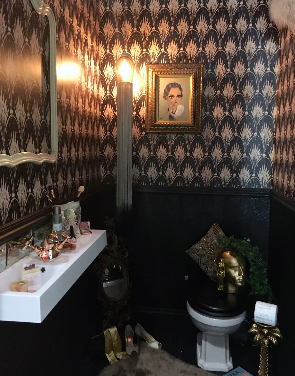
Today the Lavatory Project meets The Loo Series is back, with the latest set of photos from Grand Designs Live last May. Today’s design, by Outshine, is full of Hollywood glamour, and the more you look, the more you see.

Fully of Hollywood glamour, the Outshine Lavatory Project

There’s the obvious black and gold, but there’s also the art-deco inspired wallpaper. But look again, there’s the Oscar, the high heels, the elbow-length gold gloves and the pine tree shaped loo roll holder. That has a touch of kitsch about it, but I kind of love it all the same. That’s not even mentioning the beaded cushion behind the loo (I’m not sure why either) or the bevelled mirror tile splashback or the rose gold taps.

Black, white and gold bring a touch of glamour

Even the patterned towel, just works doesn’t it? And I bet you weren’t surprised to find the champers there either, although I think there’s much better places to store that kind of item, but it works with the concept.

The theme is carried right the way through the room set at Grand Designs Live

Even the wallpaper under the dado, has hints of art-deco patterns in the anaglypta-like covering. And every lavatory needs somewhere to hang your evening bag, and camera - especially after all that fizz.

Are you a fan of this look, or not?