Gelli printing using stencils and shapes

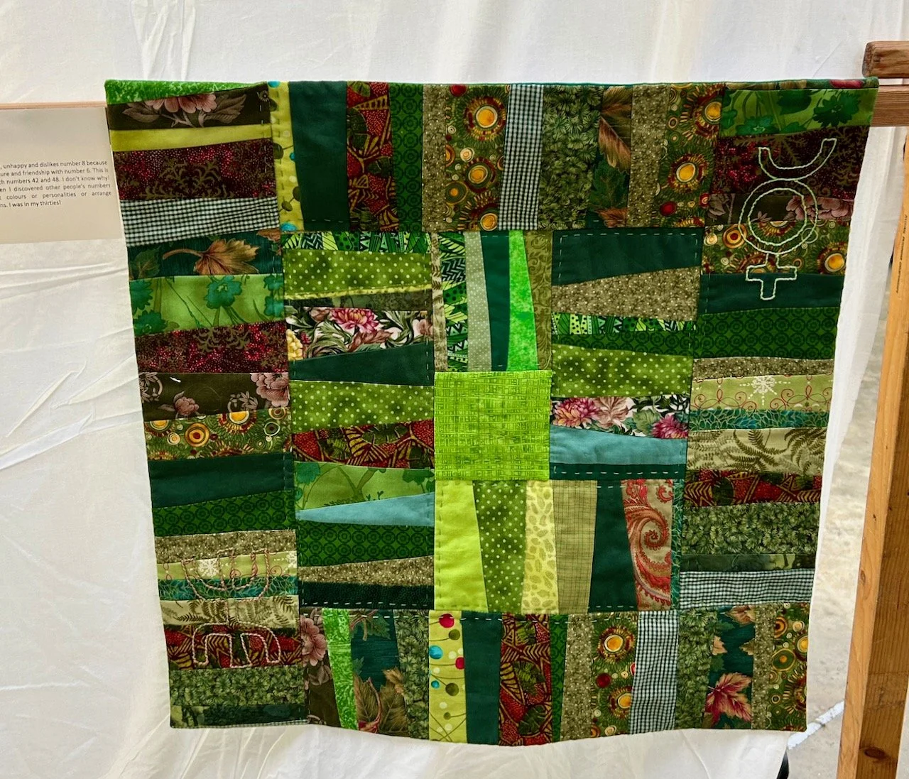
In my first post on Getting started with Gelli Plate Printing I shared the basic equipment needed and my first prints using single and two colours, here I’m going to share how using stencils and masks can bring even more texture and interest. These bring another dimension to the prints, and endless possibilities.

I already have a number of stencils, which I’m keen to try out in this new craft that’s quickly becoming one I can’t see stopping anytime soon. I’ve purchased my own gelli plate and brayer online as this is a craft that has so much potential, and is fun to do and thankfully isn’t that messy either (which is always a bonus).

Using stencils

The possibilities are endless, as are the colour combinations. It’s also easy to get two prints from the same stencil and paint application, as long as you work relatively quickly and don’t let the paint dry. I chose to use a thin plastic reusable stencil with a flowery pattern. The first two images below show the first and second prints using a single paint application, and how they differ; the third image shows a final feint print to remove the paint that remained on the gelli plate.

The third print using the residue of the paint on the gelli plate produces a very pale and ghost-like print

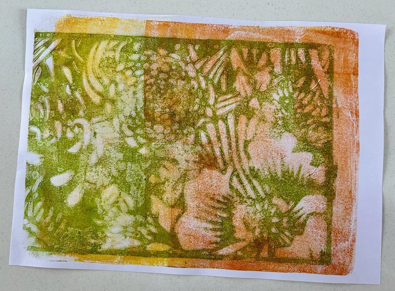
In some ways the second print is my favourite, but I know that all of them will be useful - and used - in my future papercraft crafts.

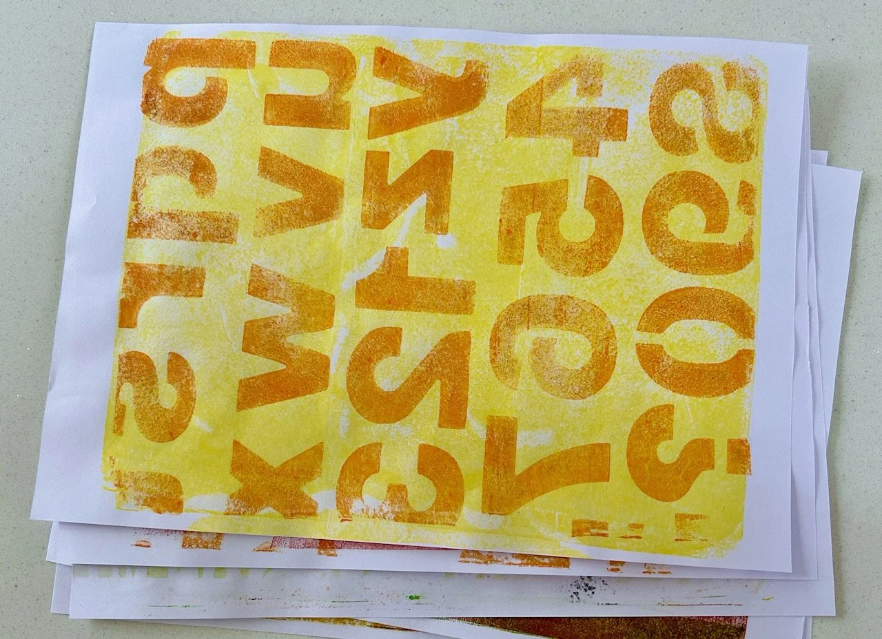
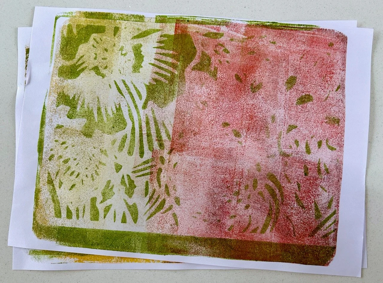
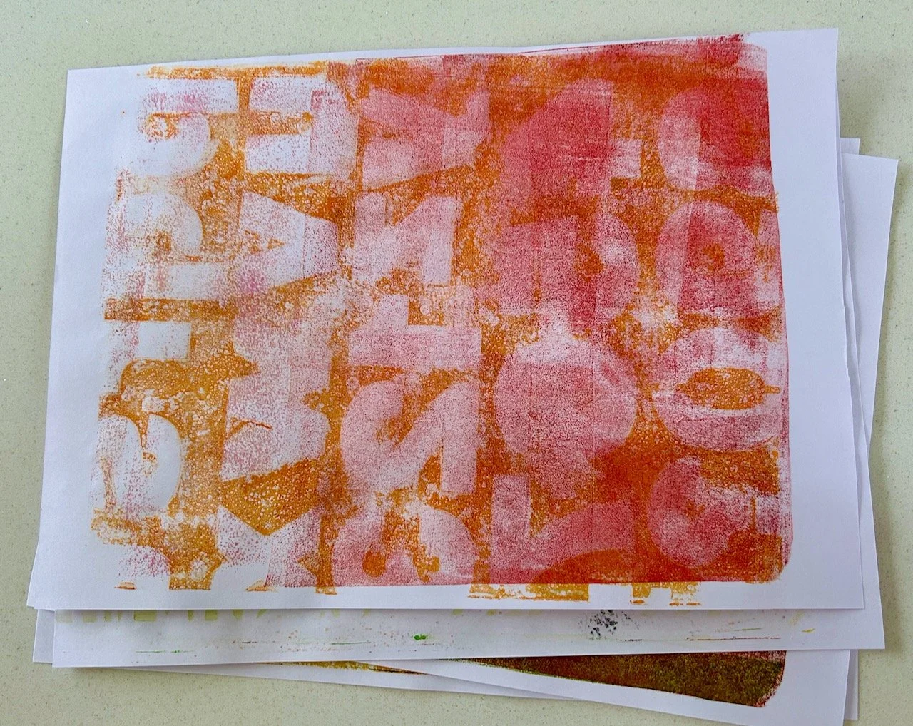
I also tried an alphabet and number stencil. I didn’t reverse this as partly this was a test of the process, but also it’s not text that needs to be read, however if that wasn’t the case the stencil will need to be reversed to avoid the mirror effect. Again I pulled two prints from a single paint application, and the softer second print is definitely my favourite of the two.

Using a number and lettering stencil with orange paint on a yellow background
The second print using the letter/number stencil on an orange and pink background

Using masks

Another technique that we tried on the course was cutting out shapes to mask areas. I cut simple blob-like circles and leaf type shapes for this. I liked the results of this less than the stencils above, but I think my choice of shapes and colours also contributed to that.

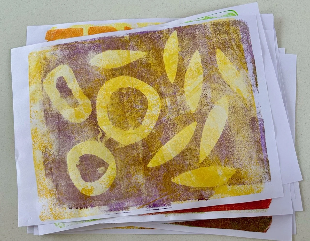
Unlike using stencils the second pull using the same paint application didn’t really add anything, the outline shape was too feint to keep. But all was not lost as the beauty of gelli plate printing is that you can reuse prints that don’t quite work out.

Using other items

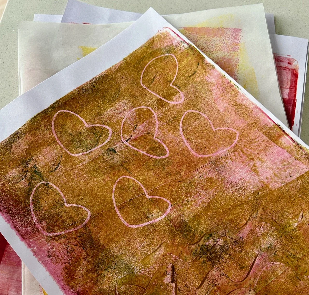
This is where your imagination can run riot. In the image below the hearts are made from a squished toilet roll - and I think they work pretty well. On the right hand side of the hearts I used a plastic glue spreader to make swirls in the paint (care: do this gently to avoid damaging the gelli plate), I think this has potential and it’s something I want to try again but perhaps with more advance thought on what shapes to try.

I also want to try using bubble wrap, scrunched up foil and paper and especially leaves. I don’t know how successful these will be, but half the fun will be experimenting. I’m sure there are many more things I can try - perhaps some lace too - and many that I haven’t thought of yet, but are no doubt lurking in my craft room somewhere!

The worst that can happen is that I’ll end up with textured papers that I can use in collages and in card making. How can that be a bad thing?

More quilts and more variety at the Newark Quilt Show

In this final post from the Newark Quilt Show I’m sharing many more of the fabulous quilts on display, and I think they’re somewhere in between Alicia Merrett’s modern quilts and Carolyn Forster’s traditionally scrappy quilts, but still just as amazing and beautiful in their own right.

Many, like the Jubilee quilt below, are made from scraps collected over many years - so that brings me some solace!

JUBILEE, JANET BEVAN

The bold quilt below is by Australian artist Brenda Wood and reflects her love of colour and shapes in her local environment, and as the blurb said truly does take an ‘in-depth and close up look at shape, colour and texture.’ For me it’s the attention to detail, even on the binding - it’s not just plain black, but some has that barcode pattern which brings further interest.

FLIGHTS OF FANCY, BRENDA WOOD

The quilts by Gillian Travis were full of colour and full of memories from her travels - both of which looked amazing!

Evolve, Mexican Red by Gillian Travis shows blocks of individual items/travel memories sewn together to create a colourful travel memory quilt

BURANO WINDOWS, GILLIAN TRAVIS

There were also quilts by the Pearoom Quilters based in Lincolnshire who responded to the challenge to produce a piece reflecting time in any way, using the log cabin block as their starting point. Unsurprisingly when you ask creative people to approach something like this, there were many interpretations - here are some of my favourites:

SUNDAY AFTERNOON, DI BELL

NUMBER 7, MARY JACKSON

ALL THE SEASONS’ COLOURS, SALLY WARREN

MAY TIME BY PAM BUNKER

There were so many in this part of the exhibition I could have chosen to share though, and narrowing it down to four quilts was hard enough.

But that wasn’t all, there’s another quilt that is absolutely stunning coming up…

THE COLOURS OF LOVE, HELEN BURNHAM

Helen made this as a wedding gift for her mathematician godson and his wife of Indian heritage - who have generously lent it back again according to the card alongside it. I do wonder just how much they’ve seen of it as I’m sure this one is in demand from all the quilt shows!

AFRICAN KELS, JANET BEVAN

One of the things I took from the quilts on display is that a quilt can be anything you want it to be - bold, bright, modern, traditional or anything in between. Whichever it is it’s most certainly made with love, and by someone who loves to create.

So often we focus on the small detail forgetting the bigger picture - I’m sure there’s a life lesson in there too!

PostCommentLove

Alicia Merrett's wow factor quilts at the Newark Quilt Show

In my first post from the Newark Quilt Show, where I admired Carolyn Forster’s quilts, I promised to show you more of the quilts on display, however I realised there were so many more that I wanted to share that I’d need to break them into smaller sections and do that over at least a couple more posts.

So in this post I’ll share something completely different to Carolyn’s quilts, but no less amazing. Here Alicia Merrett’s quilts were grouped under the title ‘Ways of Seeing’ and it’s obvious that she loves colour and texture. Alicia says that ‘beauty and feelings are important’ to her and she tries 'to convey them in her work, searching for the ‘wow’ factor’.

Alicia says her current work is ‘mostly abstract and is the result of experiments with photography, iPad apps and computer design’. The digital paintings are played with, altered, changed and distorted often with several layers being superimposed. The final designs are printed on fabric, then layered and machine stitched.

It’s a completely different approach to the quilts I shared in the previous post, but I think it’s fair to say that Alicia has definitely succeeded as her quilts definitely have the wow factor and are also beautiful works of art.

ALICIA MERRETT: DECODING THE RAINBOW

As you’ll see the rainbow is Alicia’s main source of colours, for the quilt above she says that ‘it seems as if the rainbow has an almost undecipherable code hidden within it, defiantly asking us to discover its meaning’ and so the computer code like letters accentuate that. Maybe that’s why we’re fascinated with rainbows, we’re trying to understand them as well as admire their beauty.

Alicia describes this next quilt as a ‘magical kind of Urban Jungle’ to me it has a hint of moroccan spice to it, but as for other pieces of art, we each interpret them differently and they can be many things to many people.

ALICIA MERRETT: URBAN JUNGLE

I really like this next quilt, though it’s hard to chose an absolute favourite from any of these. I think this one appeals as it is so dramatic, and so different - and once you know it’s called Eye of the Storm, that almost pulls you in too. Look closely and you’ll see the quilting is exquisite, but it also has a serious meaning the card alongside it reminding us we all need to take action, governments and individuals, as there is no Planet B.

THE RAINBOW COLOURS SWIRL AROUND IN A SINGLE CIRCULAR PATTERN

ALICIA MERRETT: EYE OF THE STORM

Though her work Alicia also explores colour further as waves of colour transmitting through the air which become particles when on the fabric. I don’t know about that but this interpretation does make for a fascinating quilt.

ALICIA MERRETT: WAVES OF COLOUR

I also enjoyed the smaller quilts on display purely for the colour, the contrast and their designs, as well as the amount of work that’s gone into creating these. Of the four below, the Colour Burst quilt (top right) is my favourite, I think that matches most closely to how colour explodes for me.

ALICIA MERRETT: HILLSIDE VILLAGE AND COLOUR BURST QUILTS

THE LITTLE BOXES AND DANCING SQUARES QUILTS DISPLAYED SIDE BY SIDE AT THE QUILT SHOW

ALICIA MERRETT: LITTLE BOXES AND DANCING SQUARES QUILTS

This last quilt which I’m sharing is one that I think you could look at for a while, and it’s the sort of image that could take your imagination in different ways depending on your mood. Knowing this is titled ‘The Colour of Nature’ initially leads me to see a garden pond with flowers, lily pads and frogs - though I suspect this isn’t quite its intention, and you may see something else entirely.

THE COLOURS OF NATURE QUILT WITH ITS ABSTRACT AND FREEFORM PATTERN USING RAINBOW COLOURS

ALICIA MERRETT: THE COLOUR OF NATURE

But isn’t that the beauty of these magnificent quilts, they allow your mind and imagination to roam?